Digital
The New Republic Website
TNR is an independent media company established in 1914, covering politics, culture, labor, climate, women’s and LGBTQ+ rights, inequality, and other pressing issues.
As Digital Design Director, I led the implementation and launch of TNR’s website redesign, originally designed by Pentagram. Following the launch, I designed a range of new CMS tools and experiences, including a series tool for linking and packaging themed articles, Beg to Differ a user rebuttal tool, a Bookstore, Travel and Events sections, Games, and an infinite-scroll breaking news experience our largest traffic driver.
I also developed a flexible system of homepage and vertical-front containers, giving editors greater control over page structure and visual presentation. In partnership with the business and development teams, I also helped integrate multiple ad vendors, creating thoughtful advertising solutions that minimized impact on the user experience.
Politics vertical front Culture vertical front Magazine landing page Series landing page — Does It Hold Up Series landing page — Rent Sucks Series landing page — Work Sucks Author page Travel page Travel — trip page Games landing page Quiz article Podcasts landing page
Vocativ Website
Vocativ’s core coverage areas were national security and technology, culture and identity, real-time news, science, data visualization, and criminal justice.
As Art Director, I led and mentored a team of 2-5 designers and art directors, establishing efficient workflows and maintaining high creative standards across digital and editorial projects. I partnered with product and engineering teams to develop wireframes and interactive web experiences, improving usability and visual storytelling across the platform. I collaborated closely with editorial teams to deliver daily visual content, including illustration, photo direction, data visualization, video title sequences, and scalable social media templates.
Feature article Author page Masthead 
Opening logo and end slate for a social series featuring trending social media content 
Logo for a web series considering all manner of worst case scenarios, covering political, climate, and global events. 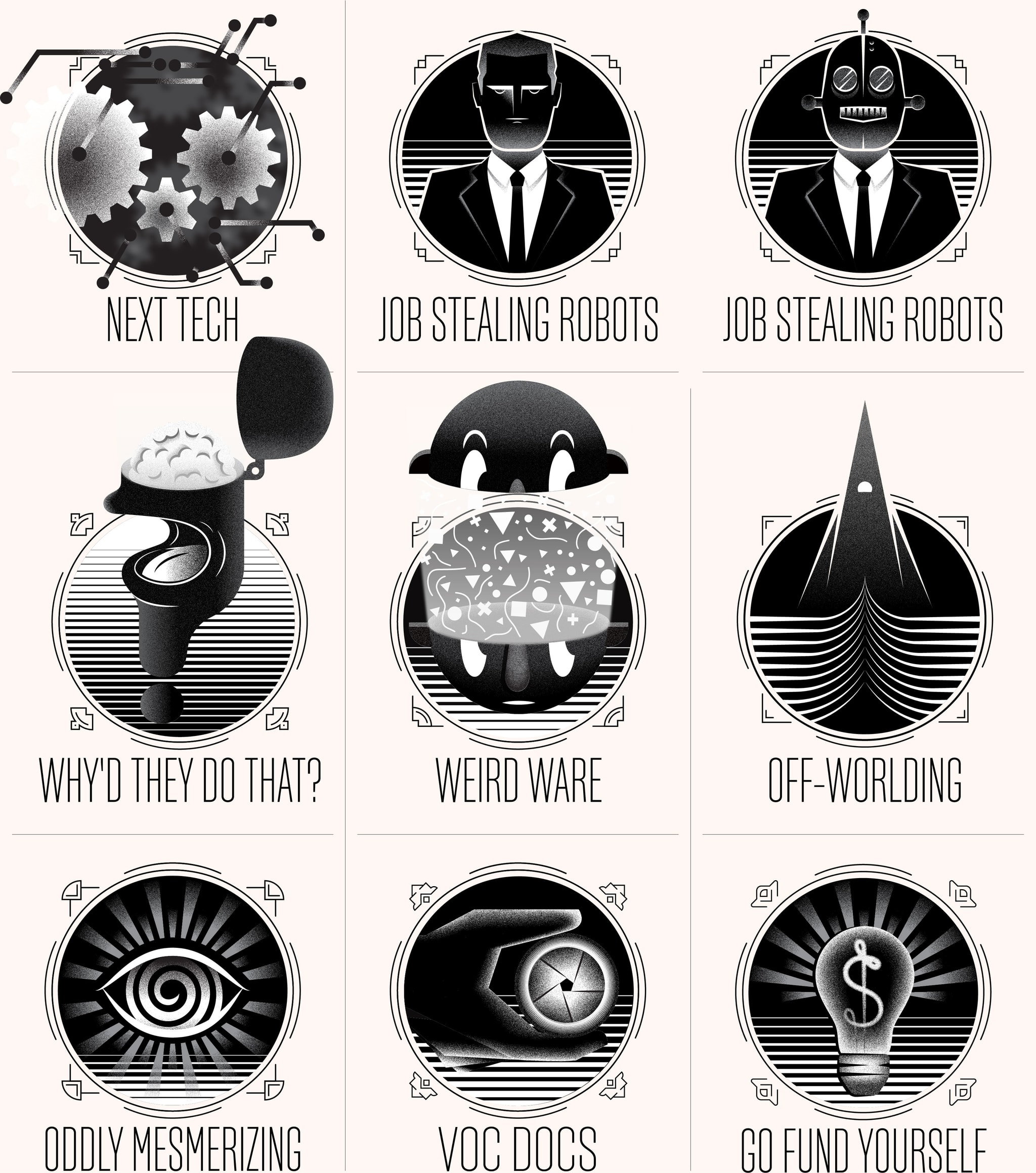
YouTube web series opening logos
Ozy Pitch Presentation
I was asked to pitch a redesign of the Ozy website homepage. At the time there was a complicated color coding system that wasn't easily understood and the different sections of the website hierarchy were varied in typeface size and weight making it difficult to quickly discern when one section started and when one ended. I simplified the color palette on the home page and made the section’s heds large and bold and clearly identifiable.